
It might not be your mattress or your screen time. The colour on your walls could be quietly working against your sleep — or helping it along. Here’s a practical, science-backed guide to picking the right shade.
Why Your Wall Colour Is Quietly Affecting Your Sleep
Cooler, muted colours calm the nervous system — lowering stress hormones and easing the body toward rest. Bright, saturated colours keep the brain alert, which is the last thing you want before bed.
In Indian homes, warm yellow-toned lighting can shift how a colour reads at night — a calm shop swatch can behave very differently under a tube light at 10 pm.
Colour #1
Soft Blues — The Classic Sleep-Inducing Shade
Why It Works
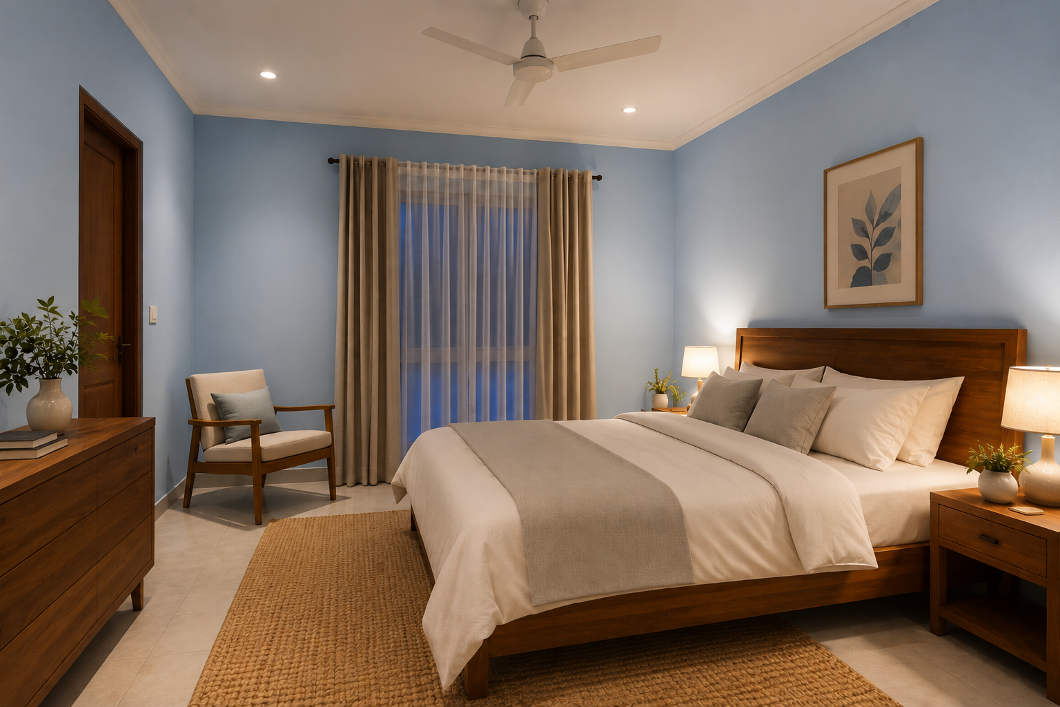
Blue has a natural calming effect — slower heart rate, less anxiety, a sense of quiet the moment you walk in. Pale enough to feel neutral, but with just enough colour to visibly soothe the room.
Try This Combo
A soft powder-blue wall with an off-white ceiling and warm wood furniture — simple, restful, and easy to live with long term. Holds up nicely under LED lighting too.
COLOUR #2
Muted Lavenders — For When Your Mind Won’t Switch Off.
The Science
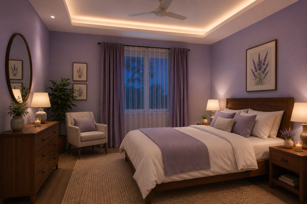
Studies link lavender to lower blood pressure and a steadier heart rate — both critical when better sleep is the goal. Go for softer, almost-neutral lavenders rather than anything too saturated.
Best For
A pale lilac-grey or gentle mauve reads as calm rather than loud, and pairs beautifully with warmer skin tones and lighting common in Indian interiors. Especially effective in south-facing rooms that get harsh afternoon sun — the coolness of the tone helps balance out all that warmth.
COLOUR #3 – Earthy Sage & Soft Greens — Nature, Indoors.
Instinctive Calm – Green has an almost instinctive association with calm and balance. A soft, greyed-out sage feels grounding without being heavy.
Indian Home Friendly – Pairs naturally with cane furniture, jute rugs, and textures already common in Indian homes. Photographs beautifully, and helps you unwind.
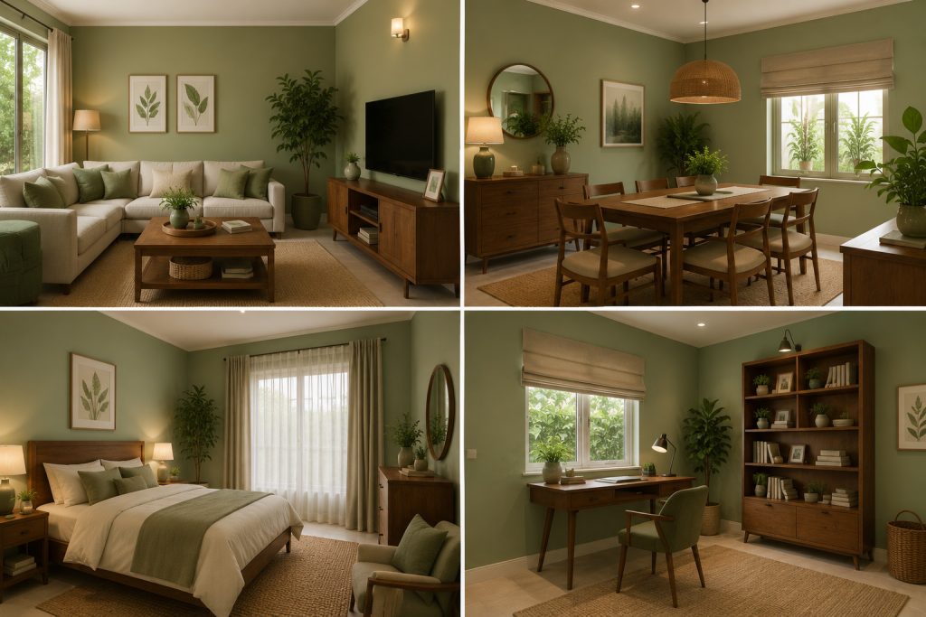
Minimal & Natural – One of the most popular choices for those leaning into a minimal, nature inspired look — quietly trending in Indian bedrooms.
COLOURS #4 & #5 – Warm Whites & Dusty Teals.
Warm Whites & Off-Whites
Ideal for smaller Indian bedrooms where dark colours can feel closing-in. A soft ivory or warm cream keeps things open and airy while supporting good sleep — cosy rather than clinical, especially with wooden furniture or brass accents.
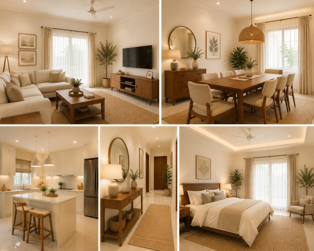
Dusty Teals
Teal borrows the calming qualities of both blue and green. A soft, dusty teal — nothing too bright — gives a grounded, spa-like feel. A favourite in contemporary Indian bedrooms, especially paired with brass, copper, or dark wood.
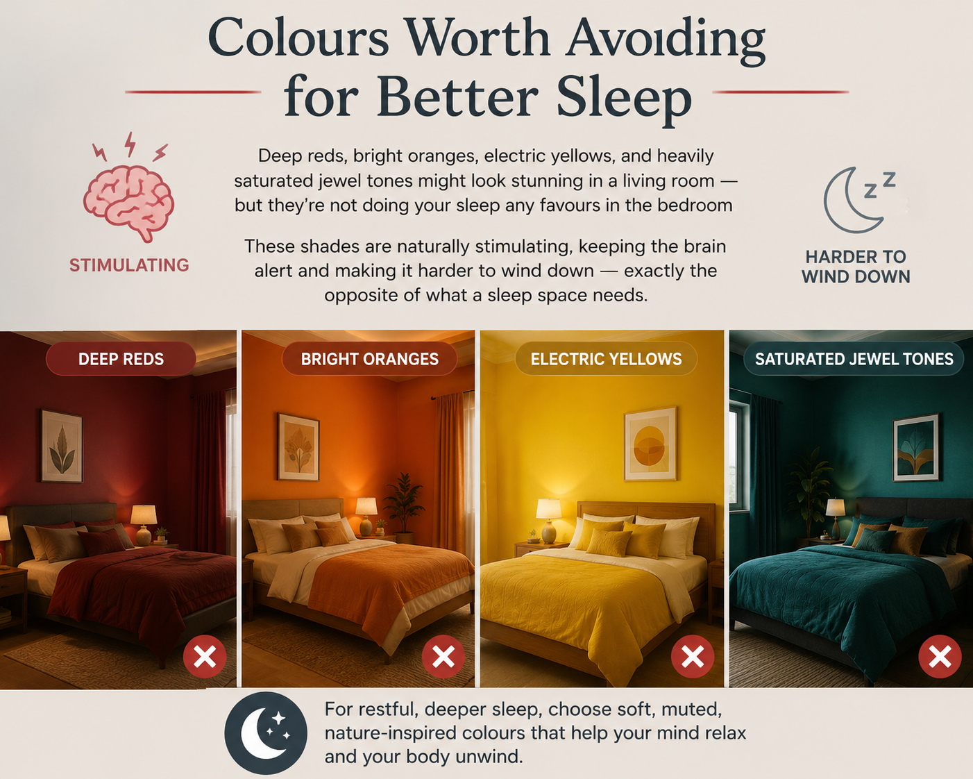
Colours Worth Avoiding for Better Sleep
Deep reds, bright oranges, electric yellows, and heavily saturated jewel tones might look stunning in a living room — but they’re not doing your sleep any favours in the bedroom. These shades are naturally stimulating, keeping the brain alert and making it harder to wind down — exactly the
opposite of what a sleep space needs.
How to Pick the Right Shade for Your Room
Patch a Swatch
Observe All Day
Pick Matt Finish
A cool blue can turn faintly greenish under a warm bulb, and a soft lavender can start looking grey under the wrong light. What looks perfect on a swatch in a bright showroom doesn’t always translate to your actual bedroom at 9 pm. Choosing a paint with a smooth, low-sheen finish — like Turbolux’s soft matte interior emulsion — keeps things calm rather than reflective, and holds its true colour well even under typical Indian home lighting.
The Takeaway
Getting your bedroom colour right isn’t about chasing a trend — it’s about picking a shade that actually helps your body wind down at the end of the day.
I- Lean toward soft blues, muted lavenders, gentle sage greens, warm off whites, or dusty teals.
II- Steer clear of anything too bold or saturated in the bedroom.
III- Always test your shade under your room’s real lighting before you commit.
Get that right, and your bedroom stops being just another room you sleep in — it becomes the one space actually designed to help you sleep well.
Quick FAQs
Which colour is best for better sleep?
Soft, muted blues are the most sleep-friendly, thanks to their calming effect on heart rate and stress. Muted lavenders and sage greens are close seconds.
Are bright colours bad for bedrooms?
For better sleep, yes — bright or highly saturated colours like red, orange, and neon yellow tend to stimulate the brain rather than calm it.
What paint finish is best?
A matte or soft-sheen finish works best, since it reduces glare and creates a calmer, more restful feel compared to a high-gloss surface.
Can wall colour really affect sleep quality?
Yes. Colour affects the nervous system, and cooler, muted tones have been shown to lower stress hormones and support better rest