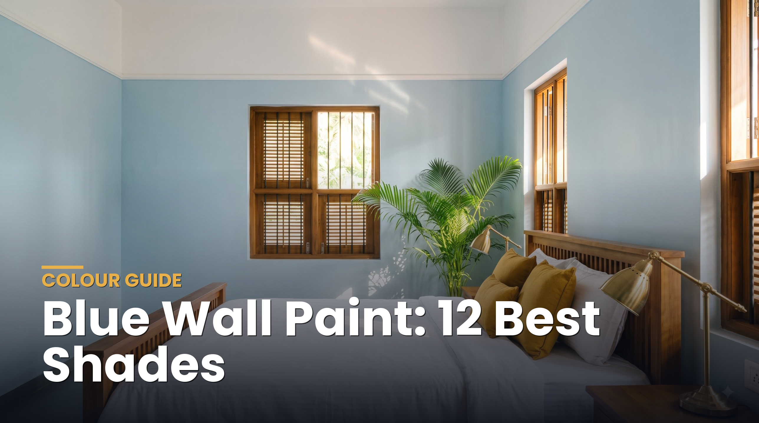
Cream sits between white and beige: warmer than an off-white, lighter and fresher than a beige. Here are 12 Turbolux creams, from barely-there dawn creams to rich butter tones, and where each one works best.
Short answer: Cream wall paint works best in rooms that need warmth without losing brightness: living rooms, bedrooms, dining areas and north-facing rooms with cool light. Pale creams with an LRV of 84 to 87, such as Kovalam Dawn and Munnar Dawn, read almost white and suit whole-house use. Butter creams with an LRV of 69 to 75, such as Dhoop Light and Kovalam Light, give a cosy, sunny glow in bedrooms and feature walls. On exteriors, cream stays bright in strong sun and hides dust better than pure white.
What is the difference between cream, off-white and beige?
All three are warm neutrals, but they sit at different points on the scale:
| Colour | What it looks like | Typical LRV | Best for |
|---|---|---|---|
| Off-white | White with a faint tint, reads as white | 85 and above | Ceilings, small rooms, whole-house base |
| Cream | White softened by a clear yellow or butter tint | About 69 to 87 | Living rooms, bedrooms, warm exteriors |
| Beige | Cream with grey or brown added, more sandy | About 60 to 80 | Larger rooms, earthy schemes, exteriors |
The key is that cream has a clean, yellow-based warmth, while beige leans sandy or pink. If you want warmth but still want a room to feel bright and fresh, cream is usually the better choice. For the neighbouring families, see our guides to off-white paint colours and beige wall paint.
What are the 12 best cream wall paint shades?
All 12 are from the Turbolux colour range. LRV (Light Reflectance Value) tells you how much light a colour bounces back, from 0 for black to 100 for white. Click any shade to see its full colour page.
| Shade | Code · Hex | LRV | Character | Best for |
|---|---|---|---|---|
| Coorg Dawn | TLX-0217 · #F3F1E1 | 87 | Whisper cream | Ceilings, small rooms, whole house |
| Kovalam Dawn | TLX-0193 · #F3F0E1 | 87 | Fresh pale cream | Living rooms, corridors |
| Munnar Dawn | TLX-0211 · #F2EFDF | 86 | Soft milky cream | Bedrooms, dining areas |
| Kutch Dawn | TLX-0187 · #F2EEDF | 85 | Classic cream | Living rooms, exteriors |
| Kanchipuram Dawn | TLX-0145 · #F2ECDF | 84 | Warm cream | North-facing rooms |
| Champa Dawn | TLX-0163 · #F0EBDB | 83 | Ivory cream | Pooja rooms, entrances |
| Varkala Dawn | TLX-0319 · #EFE3D7 | 78 | Peachy cream | Bedrooms, kids’ rooms |
| Dhoop Light | TLX-0242 · #E7E3B4 | 75 | Fresh butter | Kitchens, breakfast areas |
| Coorg Light | TLX-0218 · #E7E0B4 | 74 | Soft butter | Living room feature walls |
| Kovalam Light | TLX-0194 · #E7DDB1 | 72 | Golden cream | Exteriors, verandahs |
| Champa Light | TLX-0164 · #E7D9B1 | 70 | Honey cream | Dining rooms, exteriors |
| Kanchipuram Light | TLX-0146 · #E7D7B1 | 69 | Rich cream | Feature walls, exterior bands |
Screen colours vary, so always ask your dealer for a shade card or a small sample and look at it on your own wall, in morning and evening light, before deciding.
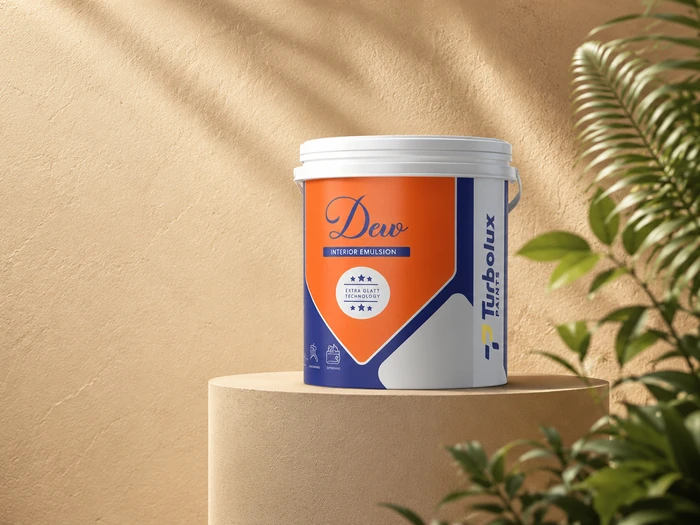
An interior emulsion with excellent whiteness and a soft sheen. GLATT Technology gives a durable finish that keeps cream walls looking clean and warm.
Interior sheen · Tinted at your dealerView Dew →Where does cream wall paint work best?
- Living rooms. A pale cream such as Kovalam Dawn or Kutch Dawn gives a welcoming warmth in the evenings while still feeling bright by day.
- Bedrooms. Munnar Dawn and Varkala Dawn are restful, soft and flattering under warm bulbs.
- North-facing and shaded rooms. Cool, indirect light can make pure white look grey. A warm cream such as Kanchipuram Dawn balances it.
- Kitchens and dining areas. Butter creams such as Dhoop Light feel sunny and cheerful, and pair well with wood and steel.
- Pooja rooms and entrances. Champa Dawn has a gentle ivory glow that suits brass, lamps and traditional decor.
Where cream works less well: very sunny west-facing rooms can make butter creams look too yellow in the afternoon. In those rooms, choose a paler Dawn shade.
What colours go with cream walls?
| Pair cream with | Effect | Try it in |
|---|---|---|
| White trims and ceilings | Crisp and fresh, makes the cream look intentional | Any room |
| Sage and olive greens | Calm, natural, garden-like | Bedrooms, verandahs |
| Navy or deep teal | Classic contrast, smart and grown-up | Living room feature walls, doors |
| Terracotta and rust | Earthy and warm, very Kerala | Exteriors, dining areas |
| Warm grey | Modern and balanced | Living rooms, studies |
| Teak and rosewood | Rich, traditional warmth | Homes with wooden ceilings or furniture |
A simple rule: use the cream on about 60% of the surfaces, a second colour on about 30%, and an accent on the last 10%.
Is cream a good exterior colour?
Yes. Cream is one of the most practical exterior colours for Indian homes. It stays light, so it reflects heat well, but it hides dust, rain splashes and road grime better than pure white. Golden creams such as Kovalam Light and Champa Light look rich against green landscaping and dark roof tiles.
- Use a high-LRV cream on large walls facing south or west to help keep them cooler.
- Add a deeper cream, such as Kanchipuram Light, on bands, pillars or the boundary wall.
- Pair with terracotta or dark brown roofs, and white or teak window frames.
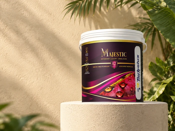
Ultra-premium weatherproof exterior emulsion with Lotus Effect Technology. Water beads off and dirt does not settle, so cream exteriors stay clean for longer.
High-sheen · 12-year durability warrantyView Majestic →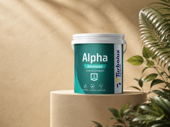
A water-based exterior emulsion with a satin-like sheen and over 1,200 shades, protecting walls against weathering while adding brightness.
Satin sheen · TintableView Alpha Advanced →How do you avoid cream looking yellow?
- Test in your own light. Paint a large sample (at least A3 size) and check it in the morning, afternoon and under your evening bulbs.
- Go one step lighter. Colour looks deeper on a full wall than on a small card. If you are unsure between two shades, choose the paler one.
- Check your bulbs. Warm yellow bulbs intensify cream. Neutral white bulbs (around 4000K) keep it soft.
- Use a white ceiling. A clean white above stops the whole room feeling yellow.
- Prime properly. A good primer gives an even base, so the cream dries to one uniform tone instead of patches.
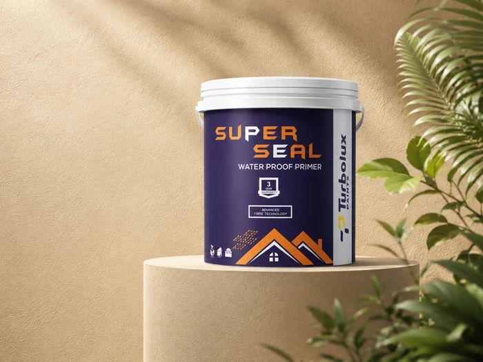
Premium acrylic primer with fibre technology that resists alkali, damp and efflorescence. Its high-opacity film lifts topcoat coverage by 15 to 20%.
Primer · Interior & exteriorView Super Seal →Frequently asked questions
Is cream colour good for a living room?
Yes. A pale cream such as Kovalam Dawn (LRV 87) or Kutch Dawn (LRV 85) keeps a living room bright while adding warmth, and it suits both modern and traditional furniture.
Which is better, cream or white?
White is crisper and suits small or dark rooms. Cream is warmer and more forgiving, hiding minor marks and looking softer under evening light. Many homes use cream walls with white ceilings.
What is the difference between cream and beige paint?
Cream is a white softened with a clean yellow or butter tint. Beige has grey or brown added, so it looks sandier and slightly deeper.
Does cream paint make a room look smaller?
Not if you choose a high-LRV cream. Shades above LRV 80 reflect most of the light in a room, so they keep it feeling open.
Can cream be used on the outside of a house?
Yes. Cream reflects heat well and hides dust better than pure white. Use a weatherproof exterior emulsion and pair it with a deeper cream or terracotta for contrast.
Found your cream?
Visit your nearest Turbolux dealer to see the shade card and get any of these creams tinted at the counter.
Find a Turbolux dealer →90728 26662 · [email protected] · Happy walls in just a stroke.